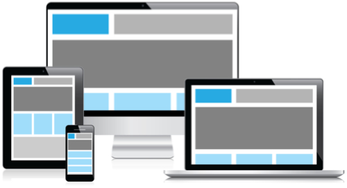
Now that a significant number of people read their email on devices other than a computer (be they smartphones, tablets, smartwatches and the like), you’ve got to wonder if the email you’re sending to them is optimized for their particular viewing experience. And we’re not talking about the email content here but its actual layout and presentation. Will the gorgeous 800 pixel wide email you just made look just as gorgeous on an iPhone when it’s proportionately shrunken down to a width of 250 pixels so that it can fit on so teeny tiny a screen? Will the design scale (and rescale itself) effectively when viewed on an Android tablet when you switch it back and forth between landscape and portrait views? Will your One Size Fits All design successfully do its job and actually fit to accommodate all sizes? Probably not.
Enter: Responsive Design.
Responsive Design is both a technique and approach you can employ to ensure that your one design has what are essentially alternate views that it displays depending on the device on which it is viewed. And this it does with these alternate views already baked into it, as it were. It’s a lot like segmenting your audience as you’re utilizing a particular presentation format that’s best suited to a particular device. By making your content display in a way that works with what your recipient is using to view it, you are increasing engagement much in the same way as customized content does. Even better, you’re often just increasing simple legibility, guaranteeing that your carefully crafted message comes across clearly.
Employing Responsive Design with your email marketing campaigns really is a lot like segmenting your content. You should know by now that making the assumption that the one body of content you’ve written up is relevant to every single person on your email list is folly, as the only way to effectively accomplish that is by grossly generalizing your message so that it can apply to anyone and everyone. And when you look at it really, diluting your message in any way isn’t a very effective email marketing tactic, at all. Your recipients wind up bored and it’s difficult to catch their attention when you use content that doesn’t really speak to them. When it comes to your message, Best Practices tells you that the One Size Fits All mentality fails. Why, then, would you use this same approach when it comes to the formatting of your message?
Check out these other helpful blog posts on the topic of Responsive Design:
– Now Is The Time for Responsive Design
– Responsive Design: The Key to Mobile Engagement
 Email Marketing Blog